

Finceptive Ltd Performance Analysis Dashboard
A comprehensive business intelligence portfolio project demonstrating enterprise sales performance tracking across revenue, customers, regions, salespeople, product categories, and transaction patterns.
Project Description
Finceptive Ltd Performance Analysis Dashboard is a comprehensive business intelligence portfolio project that demonstrates advanced data analytics and visualisation capabilities for enterprise sales performance tracking.
Built using synthetic business data, the interactive executive dashboard consolidates multi-dimensional sales metrics including $435K+ in annual revenue, customer segmentation analysis, regional performance breakdowns, salesperson productivity tracking, and product category profitability into one unified analytical platform.
The project was developed to showcase enterprise-level BI skills: transforming complex transactional data across customers, products, regions, and time periods into an intuitive drill-down analytics experience for strategic decision-making.
Project Overview
The dashboard demonstrates how organisations can move from fragmented reporting into a centralised performance management system that helps executives identify top performers, spot revenue trends, optimise territory allocation, and make data-driven decisions about resource deployment and strategic initiatives.
I designed and developed the complete analytics solution from data modelling to interactive visualisation, focusing on a professional interface that balances dense information display with clean visual hierarchy.
Business Intelligence Goals
The project was designed to answer practical executive-level questions about B2B sales performance, customer concentration, regional growth, and product category profitability.
- Track total revenue, top customers, peak sales periods, and leading salespeople.
- Compare salesperson productivity and identify top performers.
- Analyse regional performance across territories and cities.
- Evaluate customer concentration and revenue dependency risk.
- Measure product category contribution and profitability patterns.
- Understand transaction amount distribution and order value behaviour.
- Support territory allocation, pricing, inventory, and resource deployment decisions.
Key Dashboard Features
Executive KPI Header
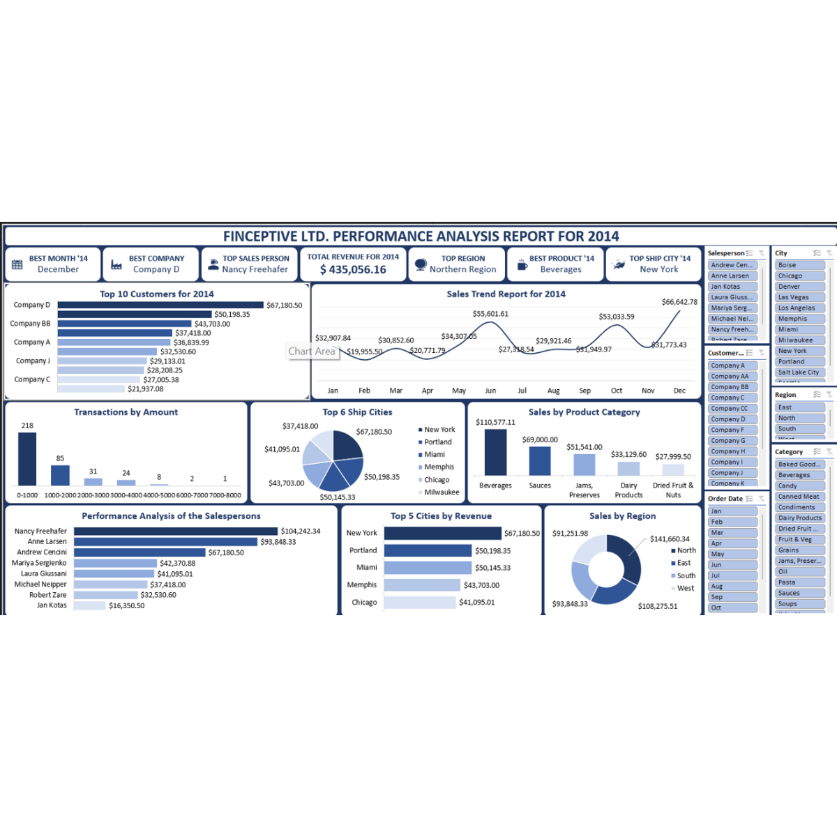
Built prominent KPI cards showing critical business metrics such as revenue, peak sales month, top customer, leading salesperson, and highest-performing region.
Monthly Sales Trend Analysis
Visualised monthly sales patterns with seasonal fluctuations ranging from $19K to $66K, helping decision-makers spot revenue trends and performance volatility.
Customer Segmentation
Analysed customer revenue contribution, including top customer performance with Company D generating $67K+ in revenue.
Salesperson Productivity Tracking
Compared sales team performance, identifying Nancy Freehafar as the leading salesperson with $104K+ in sales.
Regional Performance Breakdown
Evaluated territory performance and identified the Northern Region as the highest-performing sales territory.
Product Category Profitability
Analysed category performance, with Beverages leading at $110K+, followed by Sauces, Jams, Dairy, and Dried Fruits.
Transaction Distribution Analysis
Built transaction amount distribution visuals showing order value patterns, including 218 orders in the $0–1000 range.
Multi-Dimensional Filters
Added drill-down filters across salesperson, city, customer, region, and product category to support interactive executive exploration.
Data Model and Analytical Structure
The synthetic data model represents a realistic B2B sales operation with multi-dimensional analysis across customers, products, regions, cities, salespeople, transaction values, and time periods.
Customer Transaction Model
Structured transactional sales data to support revenue analysis, customer ranking, order value distribution, and customer concentration evaluation.
Salesperson Performance Model
Created productivity tracking logic to compare salespeople, identify top performers, and support quota-style performance analysis.
Regional and City Model
Built geographical breakdowns across regions and six major cities to evaluate market penetration and territory performance.
Product Category Model
Modelled sales contribution across product categories including Beverages, Sauces, Jams, Dairy, and Dried Fruits.
Interactive Dashboard Experience
Beyond static reporting, the dashboard features comprehensive drill-down and filtering capabilities across five core dimensions: salesperson, city, customer, region, and product category.
Executive Drill-Down Interaction Model
The interface was designed for board presentations and stakeholder briefings, allowing users to move from headline KPIs into detailed sales, customer, territory, and product analysis.
Analytics and Decision Logic
Customer Concentration Analysis
The dashboard supports customer dependency analysis, helping identify whether revenue is concentrated among a small group of high-value customers.
Territory Allocation Insight
Regional performance analysis helps decision-makers understand where to focus sales resources, expand coverage, or rebalance territory assignments.
Salesperson Quota Tracking
Salesperson performance views demonstrate how quota attainment and productivity tracking could be implemented for real sales operations.
Product Portfolio Optimisation
Product category analysis helps identify high-performing categories, underperforming segments, and opportunities for pricing or inventory optimisation.
Dashboard Design Approach
The dashboard uses a professional navy blue and white colour scheme with strategic gradients to create visual depth while keeping data readable. The design is suitable for executive reporting, board presentations, and stakeholder briefings.
- Clean executive layout with high-level KPIs placed in the header.
- Navy and white colour system for a corporate finance-style aesthetic.
- Strategic gradients used to create depth without reducing readability.
- Dense information display balanced with clear visual hierarchy.
- Interactive filters designed for fast performance exploration.
- Sales-focused layout covering revenue, customer, product, region, and salesperson views.
Technical Architecture
Data and Modelling
- Synthetic B2B sales data
- SQL and data modelling concepts
- Customer transaction modelling
- Regional sales segmentation
- Product category modelling
- Salesperson productivity logic
Analytics Layer
- Business intelligence logic
- DAX-style calculations
- Predictive analysis concepts
- Statistical analysis
- Customer lifetime value concepts
- Quota attainment tracking concepts
Visualisation Layer
- Microsoft Excel dashboarding
- Power BI / Tableau-style thinking
- Interactive slicers and filters
- Executive KPI visuals
- Sales trend charts
- Data storytelling design
Project Outcome
The outcome is a portfolio-ready business intelligence platform that demonstrates how complex B2B sales data can be consolidated into actionable executive insights. The dashboard showcases enterprise-grade data visualisation, advanced filtering, and intuitive interface design for complex datasets.
- Modelled $435K+ in annual revenue using synthetic business data.
- Identified December as the peak sales month.
- Highlighted Company D as the top customer with $67K+ in revenue.
- Identified Nancy Freehafar as the leading salesperson with $104K+ in sales.
- Showed the Northern Region as the highest-performing territory.
- Analysed product categories, with Beverages leading at $110K+.
- Visualised monthly sales fluctuations ranging from $19K to $66K.
- Displayed order value patterns, including 218 orders in the $0–1000 range.
- Created drill-down filters across salesperson, city, customer, region, and product category.
My Role
Business Intelligence Developer and Sales Performance Analyst
I designed and developed the full analytics solution, covering data modelling, KPI design, sales performance logic, interactive dashboard development, and executive visual storytelling.
I also created the synthetic business data model, structured the sales analytics dimensions, designed the filtering experience, built the KPI hierarchy, and developed the navy executive visual theme for stakeholder-ready reporting.
Leave A Comment