

Healthcare Analysis Dashboard | Patient & Operations Intelligence
A healthcare analytics dashboard designed to transform patient, admission, clinical, billing, insurance, and hospital performance data into clear decision-ready insights for operational and clinical reporting.
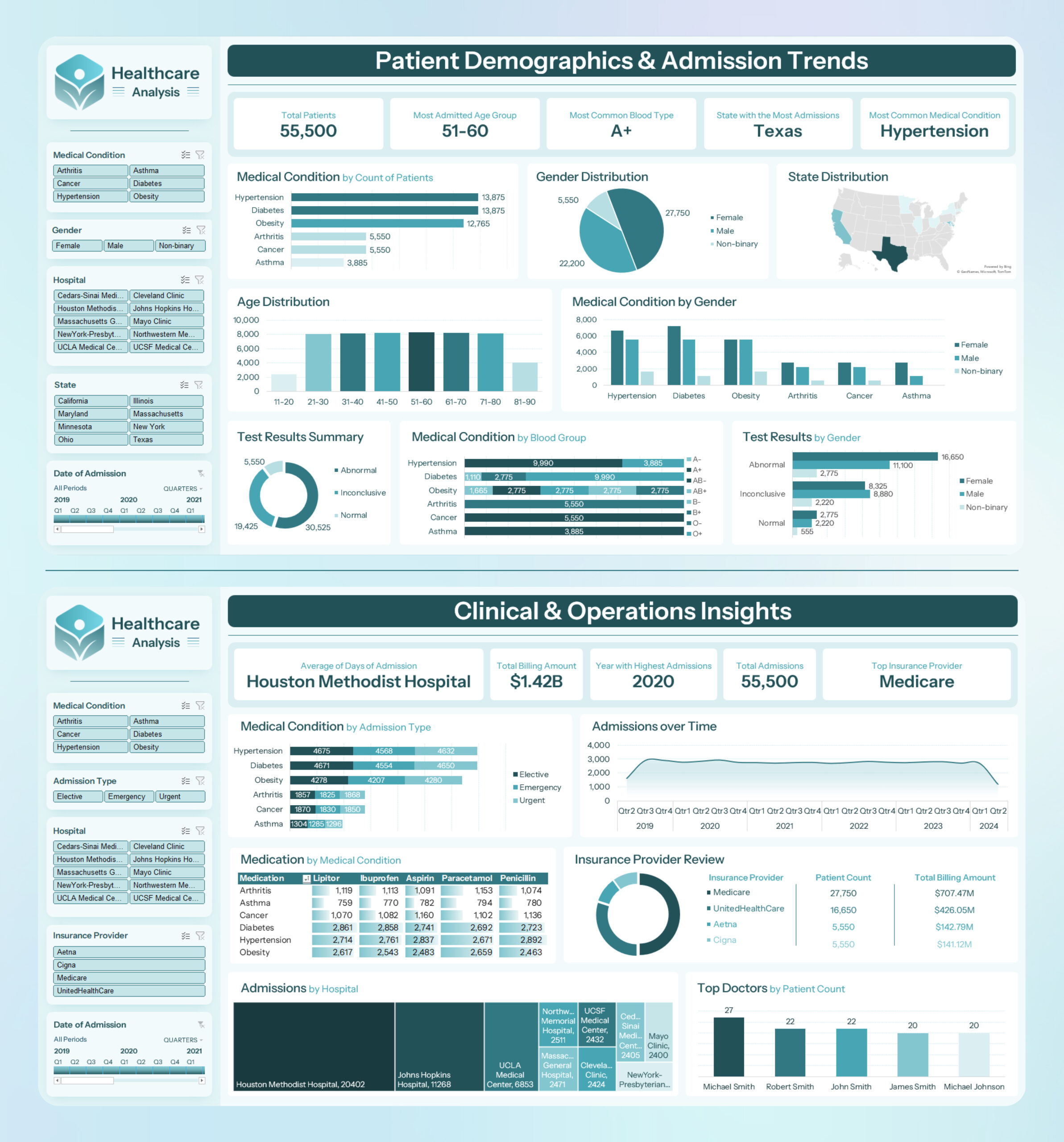
Project Description
Healthcare Analysis Dashboard is a two-page healthcare business intelligence dashboard designed to analyse patient demographics, admission trends, clinical conditions, insurance distribution, billing performance, hospital activity, and operational healthcare indicators.
The dashboard converts healthcare records into a clear visual reporting experience using KPI cards, slicers, bar charts, donut charts, map visuals, trend lines, matrix views, and treemap-style hospital breakdowns.
The first dashboard page focuses on Patient Demographics & Admission Trends, while the second page focuses on Clinical & Operations Insights. Together, they provide a structured view of patient population patterns, clinical conditions, admission activity, billing value, insurance providers, and hospital-level performance.
Project Overview
The dashboard was designed to help healthcare stakeholders quickly understand patient distribution, clinical demand, admission behaviour, insurance exposure, and operational workload across hospitals and medical categories.
It uses a calm healthcare-focused visual style with teal, aqua, and white tones, supported by a structured layout that makes complex information easy to scan. The interface includes slicers for filtering by medical condition, gender, hospital, state, admission type, insurance provider, and date of admission.
Dashboard Pages Built
Patient Demographics & Admission Trends
This page summarises patient population patterns using demographics, medical conditions, gender distribution, age distribution, blood group analysis, test result summaries, state distribution, and admission date filters.
Clinical & Operations Insights
This page focuses on operational healthcare analysis including average admission days, total billing amount, admission trends over time, insurance provider review, admissions by hospital, and top doctors by patient count.
Key Insights Displayed
- Total Patients: 55,500 shown on the demographics page.
- Most Admitted Age Group: 51–60 shown in the KPI section.
- Most Common Blood Type: A+ shown in the KPI section.
- State with the Most Admissions: Texas shown in the KPI section and map visual.
- Most Common Medical Condition: Hypertension shown in the KPI section.
- Average Days of Admission: Houston Methodist Hospital shown as the highlighted hospital.
- Total Billing Amount: $1.42B shown on the operations page.
- Year with Highest Admissions: 2020 shown in the operations KPI section.
- Top Insurance Provider: Medicare shown in the operations KPI section.
Patient Demographics Analysis
Medical Condition Analysis
The dashboard compares patient counts by medical condition, including Hypertension, Diabetes, Obesity, Arthritis, Cancer, and Asthma.
Gender Distribution
A donut visual shows patient distribution across Female, Male, and Non-binary categories.
Age Distribution
The age distribution chart groups patients into age bands from 11–20 through 81–90, helping show patient age concentration across the dataset.
State Distribution
A map visual highlights admission distribution by state, with Texas shown as the state with the most admissions.
Clinical and Operations Analysis
Admissions Over Time
A time-series visual tracks admissions across quarters and years, showing admission movement from 2019 to 2024.
Insurance Provider Review
The insurance section compares providers including Medicare, UnitedHealthCare, Aetna, and Cigna, with patient count and total billing amount shown.
Admissions by Hospital
A treemap-style visual compares hospital admission volumes across hospitals such as Houston Methodist Hospital, Johns Hopkins Hospital, and UCLA Medical Center.
Top Doctors by Patient Count
A bar chart ranks doctors by patient count, showing named doctors and their relative patient volume.
Interactive Filtering System
The dashboard includes a left-side filtering panel designed for non-technical users. These slicers allow viewers to explore the data across clinical, demographic, operational, and time-based dimensions without changing the underlying dataset.
Dashboard Filter Controls
The slicers make the dashboard practical for healthcare reporting, allowing users to narrow the analysis by patient, hospital, clinical, insurance, and admission dimensions.
Dashboard Design Approach
The dashboard uses a healthcare-inspired design system with soft aqua backgrounds, teal headers, white chart containers, rounded KPI cards, and structured spacing. This gives the report a clean clinical appearance while keeping the insights readable and presentation-ready.
- Two-page dashboard layout separating patient demographics from operations insight.
- Healthcare-style teal and aqua colour palette for a calm clinical feel.
- Large KPI cards for quick executive reading.
- Left-side slicer panel for easy filtering and exploration.
- Combination of bar charts, donut charts, maps, matrix views, treemaps, and line charts.
- Clear visual hierarchy for senior management, analysts, and operational users.
Technical Architecture
Data and Modelling
- Healthcare patient dataset
- Patient demographics modelling
- Admission date modelling
- Medical condition categorisation
- Hospital and state dimensions
- Insurance provider analysis
Analytics Layer
- Healthcare KPI development
- Patient count analysis
- Admission trend analysis
- Billing amount analysis
- Clinical condition segmentation
- Operational performance comparison
Visualisation Layer
- Power BI-style dashboard design
- Interactive slicers
- KPI cards
- Bar and stacked bar charts
- Donut charts
- Map and treemap visuals
Project Outcome
The final dashboard demonstrates how healthcare data can be transformed into a structured, visual intelligence system for patient demographics, admission monitoring, clinical condition analysis, insurance review, hospital comparison, and operational reporting.
- Created a two-page healthcare dashboard covering demographics and operations.
- Displayed 55,500 total patients/admissions in the report.
- Highlighted 51–60 as the most admitted age group shown.
- Identified A+ as the most common blood type shown.
- Showed Texas as the state with the most admissions.
- Highlighted Hypertension as the most common medical condition shown.
- Displayed $1.42B as the total billing amount on the operations page.
- Showed 2020 as the year with highest admissions.
- Presented Medicare as the top insurance provider shown.
- Included interactive slicers for medical condition, gender, hospital, state, admission type, insurance provider, and date.
My Role
Healthcare BI Dashboard Developer and Data Analyst
I designed and developed the healthcare dashboard structure, including the KPI hierarchy, report pages, slicer layout, visual selection, chart organisation, clinical segmentation, admission trend analysis, and operational reporting views.
I also created the healthcare-themed visual design system, organised the dashboard into patient demographics and operations insight pages, and structured the report to support clear stakeholder interpretation.
Leave A Comment