

Pizza Sales Performance Dashboard
A sales analytics dashboard designed to analyse pizza revenue, order volume, product category performance, customer ordering behaviour, peak trading times, and best/worst-selling pizzas in one executive-ready reporting view.
Project Description
Pizza Sales Performance Dashboard is a restaurant sales analytics dashboard designed to convert pizza transaction data into clear performance insights. The report tracks revenue, order count, pizza volume, average order value, average pizzas per order, busiest trading periods, pizza category mix, pizza size contribution, and best and worst sellers.
The dashboard presents a complete view of sales performance using KPI cards, daily trend charts, hourly order trends, donut charts, category ranking visuals, product-level seller rankings, and date filters.
The design uses a dark restaurant-style visual theme with warm orange, yellow, and blue accents, giving the report a strong branded feel while keeping the key metrics visible and easy to interpret.
Project Overview
The dashboard was designed to help restaurant operators understand what is driving sales performance across time, product type, product size, and individual pizza names. It gives a fast executive view of business health while also supporting deeper product and timing analysis.
It highlights which days generate the highest order volume, which hours are busiest, which pizza categories contribute most to sales, which pizza sizes dominate revenue, and which individual products are strongest or weakest performers.
Main Dashboard Components
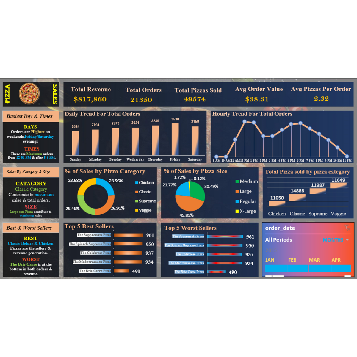
Executive KPI Header
The top KPI row shows total revenue, total orders, total pizzas sold, average order value, and average pizzas per order.
Busiest Day and Time Insights
A dedicated insight panel highlights that orders are highest on Friday/Saturday evenings, with maximum orders between 12-01 PM and after 5-8 PM.
Daily and Hourly Order Trends
The dashboard includes daily order bars and hourly order trend lines to show when demand rises and where operational pressure is strongest.
Category and Size Mix
Donut visuals show sales contribution by pizza category and pizza size, helping identify product mix and customer preference patterns.
Best and Worst Sellers
Product ranking charts show the top five best sellers and top five worst sellers, supporting product strategy and menu optimisation.
Date Filtering Panel
The date filter section allows the report to focus on selected periods, supporting month-based sales analysis.
Key Metrics and Insights Shown
- Total Revenue: $817,860.
- Total Orders: 21,350.
- Total Pizzas Sold: 49,574.
- Average Order Value: $38.31.
- Average Pizzas Per Order: 2.32.
- Busiest Days: Friday and Saturday evenings shown as highest-order periods.
- Peak Times: 12-01 PM and after 5-8 PM shown as maximum order windows.
- Top Category Message: Classic category contributes maximum sales and total orders.
- Top Size Message: Large size pizza contributes maximum sales.
Sales Trend Analysis
Daily Trend for Total Orders
The daily trend visual compares orders across the week. The dashboard shows Friday as the highest order day with 3,538 orders, followed by Thursday with 3,239 and Saturday with 3,158.
Hourly Trend for Total Orders
The hourly line chart shows demand rising from late morning, peaking around lunch and evening trading windows, and reducing again toward late night.
Sales by Pizza Category
Category share is shown across Chicken, Classic, Supreme, and Veggie, with the dashboard insight stating that Classic contributes the maximum sales and total orders.
Sales by Pizza Size
Pizza size share is compared across Medium, Large, Regular, and X-Large. The chart shows Large as the biggest share at 45.89%.
Product Performance Analysis
Total Pizza Sold by Category
The category ranking shows pizza volume across Chicken, Classic, Supreme, and Veggie. The values shown include 11,050 for Chicken, 14,888 for Classic, 11,987 for Supreme, and 11,649 for Veggie.
Top 5 Best Sellers
The best seller chart ranks The Soppressata Pizza, The Spinach Supreme Pizza, The Calabrese Pizza, The Mediterranean Pizza, and The Brie Carre Pizza.
Top 5 Worst Sellers
The worst seller chart uses the same visible ranked products, including The Soppressata Pizza, The Spinach Supreme Pizza, The Calabrese Pizza, The Mediterranean Pizza, and The Brie Carre Pizza, with the displayed values ranging from 961 to 490.
Menu Optimisation Insight
The report is structured to support menu decisions by comparing product popularity, category contribution, size mix, and time-based ordering behaviour in one place.
Interactive Filtering System
The dashboard includes a date filter panel for period-based analysis. This allows users to explore sales performance by selected periods rather than viewing the entire dataset at once.
Dashboard Filter Controls
The visible filter section focuses on order date and month-based selection, supporting basic time-period analysis for restaurant performance review.
Dashboard Design Approach
The dashboard uses a dark restaurant-style theme with warm orange and yellow highlights for sales metrics, supported by blue-toned panels and strong chart contrast. This creates a visually bold dashboard suitable for portfolio presentation and operational reporting.
- Dark background with warm orange and yellow KPI highlights.
- Executive KPI row for fast business performance reading.
- Clear daily and hourly demand visuals for operational planning.
- Donut charts for pizza category and size contribution.
- Best and worst seller charts for menu performance insight.
- Date filter panel for period-based sales review.
Technical Architecture
Data Structure
- Pizza sales transaction dataset
- Order date dimension
- Pizza category dimension
- Pizza size dimension
- Product name dimension
- Order value and quantity measures
Analytics Layer
- Total revenue calculation
- Total orders calculation
- Total pizzas sold calculation
- Average order value analysis
- Average pizzas per order analysis
- Category and size contribution analysis
Visualisation Layer
- KPI cards
- Daily order bar chart
- Hourly order line chart
- Donut charts
- Product ranking visuals
- Date filter panel
Project Outcome
The final dashboard demonstrates how restaurant sales data can be transformed into a practical business intelligence report for revenue tracking, product mix analysis, peak-time planning, menu optimisation, and operational decision-making.
- Displayed $817,860 total revenue.
- Displayed 21,350 total orders.
- Displayed 49,574 total pizzas sold.
- Calculated $38.31 average order value.
- Calculated 2.32 average pizzas per order.
- Highlighted Friday as the highest order day shown, with 3,538 orders.
- Showed Large pizza size as the largest sales share at 45.89%.
- Compared pizza category volume across Chicken, Classic, Supreme, and Veggie.
- Included best and worst seller views for product-level menu analysis.
My Role
Sales Dashboard Designer and Restaurant Data Analyst
I designed the dashboard structure, KPI hierarchy, visual layout, chart selection, time-based analysis, product ranking logic, and restaurant performance storytelling.
I organised the analysis around revenue, orders, pizza quantity, daily and hourly demand, category performance, size contribution, and best/worst seller analysis to support clear restaurant decision-making.
Leave A Comment