

McKinsey Solve Global Analytics Report | 2018-2025
A McKinsey Solve assessment analytics dashboard designed to visualise test taker performance, pass rates, applicant distribution, university outcomes, regional game performance, and demographic patterns across a global report covering 2018 to 2025.
Project Description
McKinsey Solve Global Analytics Report is a dashboard-based assessment intelligence report built to analyse application volume, pass rates, assessment outcomes, score performance, demographic trends, and regional behaviour in a structured and decision-ready format.
The report presents key indicators such as Total Test Takers, Pass Rate, Country with Most Applicants, and Most Selected Department, supported by visual analysis across education level, country, year, age group, university, region, and employment status.
The dashboard is shown in both a light mode and a dark mode variant, demonstrating a polished reporting design system with consistent visual structure across themes.
Project Overview
The dashboard was designed to convert assessment-related data into an executive-style analytical view. It combines KPI cards, bar charts, a gauge chart, a world map, line charts, donut charts, and category filters into one clear reporting experience.
The report covers a range of analytical questions including how candidates perform by education level, how pass rates vary geographically, how average scores move over time, which age bands dominate the sample, which universities rank highest, and how applicant segments differ by employment status.
Main Dashboard Components
Headline KPI Summary
The top KPI row highlights the main decision-making indicators: total test takers, pass rate, country with most applicants, and most selected department.
Assessment Outcome Analysis
The dashboard compares pass and fail outcomes by education level, creating a quick view of assessment performance across academic groups.
Demographic and Score Analysis
Score visuals track average assessment performance, age distribution, and applicant composition in ways that are easy to scan and compare.
Global and Regional Insight
Geographic and regional visuals show pass rate by country and individual game performance by region, adding a global comparison layer to the report.
Key Metrics and Insights Shown
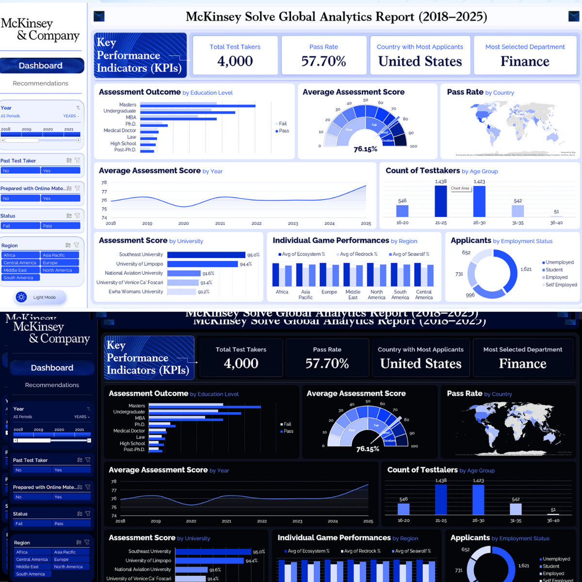
- Total Test Takers: 4,000.
- Pass Rate: 57.70%.
- Country with Most Applicants: United States.
- Most Selected Department: Finance.
- Average Assessment Score: 76.15% shown in the gauge chart.
- Age Group Counts Shown: 16-20 (546), 21-25 (1,438), 26-30 (1,423), 31-35 (542), 36-40 (51).
- Top Universities Shown: Southeast University, University of Limpopo, National Aviation University, University of Venice Ca’ Foscari, and Ewha Womans University.
- Employment Status Categories Shown: Unemployed, Student, Employed, and Self Employed.
Assessment and Applicant Analysis
Assessment Outcome by Education Level
A horizontal bar comparison shows pass and fail outcomes across Masters, Undergraduate, MBA, Ph.D., Medical Doctor, Law, High School, and Post-Ph.D..
Average Assessment Score
A gauge visual shows an average assessment score of 76.15%, with performance bands ranging from low to excellent.
Pass Rate by Country
A global map visual highlights pass rate distribution across countries, helping compare geographic performance at a glance.
Average Assessment Score by Year
A line chart tracks score performance from 2018 to 2025, showing slight variation over time with an upward finish at the end of the series.
Count of Testtakers by Age Group
A column chart shows age distribution across five groups, with the largest concentrations in the 21-25 and 26-30 bands.
Assessment Score by University
The university score chart ranks institutions including Southeast University (95.0%), University of Limpopo (94.4%), National Aviation University (91.6%), University of Venice Ca’ Foscari (91.4%), and Ewha Womans University (91.2%).
Individual Game Performances by Region
A grouped bar chart compares three game dimensions, Avg of Ecosystem %, Avg of Redrock %, and Avg of Seawolf %, across Africa, Asia Pacific, Europe, Middle East, North America, South America, and Central America.
Applicants by Employment Status
A donut chart segments applicants by employment status across Unemployed, Student, Employed, and Self Employed, with visible segment values of 1,621, 996, 731, and 652.
Interactive Filtering System
The left-side control panel makes the report interactive and easy to use. Viewers can narrow the dashboard by multiple dimensions to explore specific segments of the assessment dataset.
Dashboard Filters and Navigation
The sidebar includes navigation tabs and filter blocks that support exploratory analysis across the report.
Light and Dark Mode Design
A distinctive aspect of this report is that it is presented in both a light theme and a dark theme, using the same layout structure and analytical content across both modes.
Light Theme
The light theme uses a clean white background with soft blue accents, giving the report a professional consulting-style appearance suitable for presentation and executive review.
Dark Theme
The dark theme uses deep navy and black surfaces with bright blue chart accents, creating a more premium, modern analytics experience while preserving readability and visual hierarchy.
Dashboard Design Approach
- Consulting-style layout inspired by executive analytics dashboards.
- Clear KPI header row for immediate business context.
- Combination of bar charts, gauge chart, map, line chart, and donut chart.
- Left sidebar for navigation, filtering, and theme presentation.
- Consistent structure across both light mode and dark mode versions.
- Strong use of blue tones to reinforce brand-style analytical clarity.
Technical Architecture
Data Structure
- Test taker dataset
- Country dimension
- Education level dimension
- Age group segmentation
- University comparison
- Employment status categorisation
Analytics Layer
- KPI development
- Pass and fail analysis
- Score trend analysis
- Regional performance comparison
- Demographic distribution analysis
- Global pass rate analysis
Visualisation Layer
- KPI cards
- Horizontal bar charts
- Gauge chart
- World map visual
- Line chart and grouped bar chart
- Interactive slicer-style filters
Project Outcome
The final report demonstrates how assessment data can be transformed into a clean and interactive analytics dashboard that supports performance review, demographic analysis, geographic comparison, and candidate segmentation.
- Presented a complete McKinsey Solve analytics dashboard covering 2018 to 2025.
- Displayed 4,000 total test takers and a 57.70% pass rate.
- Highlighted United States as the country with most applicants.
- Highlighted Finance as the most selected department.
- Showed an average assessment score of 76.15%.
- Compared assessment outcomes by education level.
- Tracked age-group distribution and university score performance.
- Included regional game performance analysis and employment-status segmentation.
- Demonstrated both light and dark themed dashboard variants.
My Role
Analytics Dashboard Designer and Data Visualisation Developer
I designed the full dashboard structure, KPI hierarchy, visual layout, filter arrangement, theme presentation, and analytical flow across the report. I organised the insights into clear sections so that viewers can quickly understand test taker volume, score quality, pass behaviour, and demographic distribution.
I also developed the light and dark visual variants to show how the same analytics system can be presented in multiple styles while maintaining a consistent structure and decision-ready readability.
Leave A Comment